
In the era of information overload, the ability to extract meaningful insights from vast datasets is a game-changer. This is where data visualization tools come to the forefront, transforming complex data into easily understandable visuals. As we step into 2024, the significance of these tools in various industries is paramount. This article dives into the leading data visualization tools for 2024, exploring their features, applications, and how they empower professionals to turn insights into actionable visuals.
12 Best Data Visualization Tools for 2023
Data visualization is the process of transforming data into visual representations that help us to understand it more easily. Data visualization tools can be used to create charts, graphs, maps, and other visualizations that can be used to communicate insights from data.
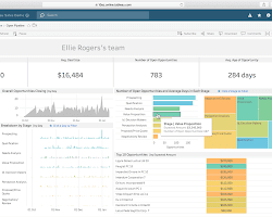
1. Tableau: Empower Visual Analytics
- Tableau offers interactive and dynamic visualizations.
- Its drag-and-drop interface simplifies data exploration.
- Tableau Public allows sharing of interactive dashboards.


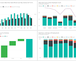
2. Power BI: Microsoft’s Data Visualization Marvel
- Power BI integrates seamlessly with other Microsoft tools.
- It offers rich visualizations, analytics, and customizable dashboards.
- Power BI Desktop enables in-depth data modeling and analysis.


3. Google Data Studio: Unleash Google’s Visualization Power
- Google Data Studio creates customizable and interactive reports.
- It integrates with various data sources, including Google Analytics.
- Real-time collaboration and sharing enhance teamwork.

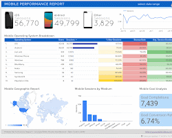
4. QlikView: The Intuitive Data Discovery Tool
- QlikView offers associative data modeling for quick insights.
- Its in-memory data processing accelerates analysis.
- QlikView’s user-driven interface fosters data exploration.
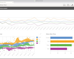
5. D3.js: Custom Visualizations for Developers
- D3.js is a JavaScript library for creating custom data visualizations.
- Developers can build unique and interactive visualizations.
- D3.js offers flexibility and control over the design process.
![]()
6. Plotly: Interactive Visualizations with Python
- Plotly supports interactive visualizations using Python.
- Its libraries can be used for data analysis and dashboard creation.
- Plotly’s versatility suits various data-driven applications.
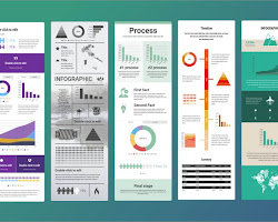
7. Infogram: Simplify Infographic Creation
- Infogram enables easy creation of infographics, charts, and reports.
- Its user-friendly interface requires no coding skills.
- Infogram is suitable for content creators and marketers.
8. Highcharts: Interactive Charts for Web Applications
- Highcharts offers JavaScript-based interactive charts.
- It supports a wide range of chart types and customization options.
- Highcharts’ compatibility with web applications enhances user experience.
 Opens in a new window
 stackoverflow.com
9. Looker: Data Exploration and Collaboration
- Looker facilitates data exploration and collaboration.
- It offers a unified view of data and integrates with other tools.
- Looker’s data modeling capabilities enhance analysis.

10. Sisense: Simplified Data Analytics
- Sisense enables data blending and mashup for insights.
- Its In-Chip™ analytics accelerates data processing.
- Sisense’s drag-and-drop interface caters to non-technical users.
![]() Opens in a new window
Opens in a new window getlogovector.com
11. Datawrapper: Focus on Simplicity
Datawrapper embraces simplicity in data visualization. It offers easy-to-create charts and maps that suit a wide range of data types. With a focus on clarity and accessibility, Datawrapper enables professionals to communicate data insights effectively.
12. Google Charts: Accessibility at Its Core
Google Charts brings data visualization to a wider audience. Its simplicity and accessibility make it a viable choice for beginners and small businesses. From simple bar charts to intricate interactive visuals, Google Charts covers a broad spectrum of data visualization needs.
![]()
Additional thoughts on the future of data visualization:
- Data visualization will become more interactive: Interactive data visualizations allow users to explore data in more depth and to get a better understanding of the underlying trends. This trend is being driven by the increasing popularity of web and mobile devices, which make it possible to create interactive visualizations that can be easily shared and viewed on any device.
- Data visualization will become more personalized: Personalized data visualizations are tailored to the specific needs of the user. This trend is being driven by the increasing availability of data about individuals, such as their demographics, interests, and purchase history. Personalized data visualizations can be used to provide users with more relevant and engaging information.
- Data visualization will become more embedded: Data visualizations will be embedded in more applications and websites. This trend is being driven by the increasing demand for data-driven decision-making. Embedded data visualizations can provide users with real-time insights into data, which can be used to make better decisions.
- Data visualization will become more AI-powered: AI will be used to automate the creation of data visualizations. This trend is being driven by the increasing availability of data and the increasing power of AI algorithms. AI-powered data visualizations can be used to create more accurate and insightful visualizations with less human intervention.
“In the realm of data, visualization fuels understanding and drives progress.”
Daoox.
Additional thoughts on the challenges and opportunities of data visualization:
Challenges:
- Data visualization can be time-consuming and challenging to create, especially for complex data sets.
- It can be difficult to create data visualizations that are both accurate and visually appealing.
- It can be difficult to interpret data visualizations, especially for those who are not familiar with data analysis.
Opportunities:
- a visualization can be used to communicate complex ideas in a clear and concise way.
- Data visualization can be used to identify trends and patterns in data that would not be visible otherwise.
- Data visualization can be used to make data-driven decisions.
By overcoming the challenges and seizing the opportunities, data visualization can become a powerful tool for communication, decision-making, and problem-solving.
Conclusion: Visualizing Insights, Transforming Decisions
As we conclude our journey through the leading data visualization tools for 2024, it’s evident that these tools bridge the gap between raw data and actionable insights. In an age where information holds the key to success, visualizations play a pivotal role in conveying complex data in a comprehensible manner.
Each tool serves as a conduit through which professionals can translate intricate data into visuals that inform decisions. By embracing these tools, industries across the spectrum can harness the power of visual analytics, unlocking a future where data-driven decisions are not just a concept, but a reality. As you explore the landscape of data visualization, remember that these tools are your gateway to turning insights into visual stories that drive progress and innovation.
Read more articles
20 Fastest Growing Startups In 2024: Unveiling Innovation and Progress